llantarnam Grange Arts Centre, Cwmbran 2011

Resonant Colour
‘The purest and most thoughtful minds are those which love colour the most.’ John Ruskin.
A colourist’s talent is emotive, instinctive, inherent. Colour can be rationalised, analysed and explained to a certain extent, but to my mind, the poetry of colour is best enjoyed on impact.
It was a true privilege to be invited by Llantarnam Grange Arts Centre to exhibit recent bodies of my work and to curate an accompanying selection of work from other artists whose work resonates with my primary preoccupation: colour.
And so I indulgently drew up my ‘wish list’ of UK-based applied artists whose work I have long admired or recently discovered. I feel duly honoured that all invitees said yes and thus I have had the great pleasure of compiling this show.
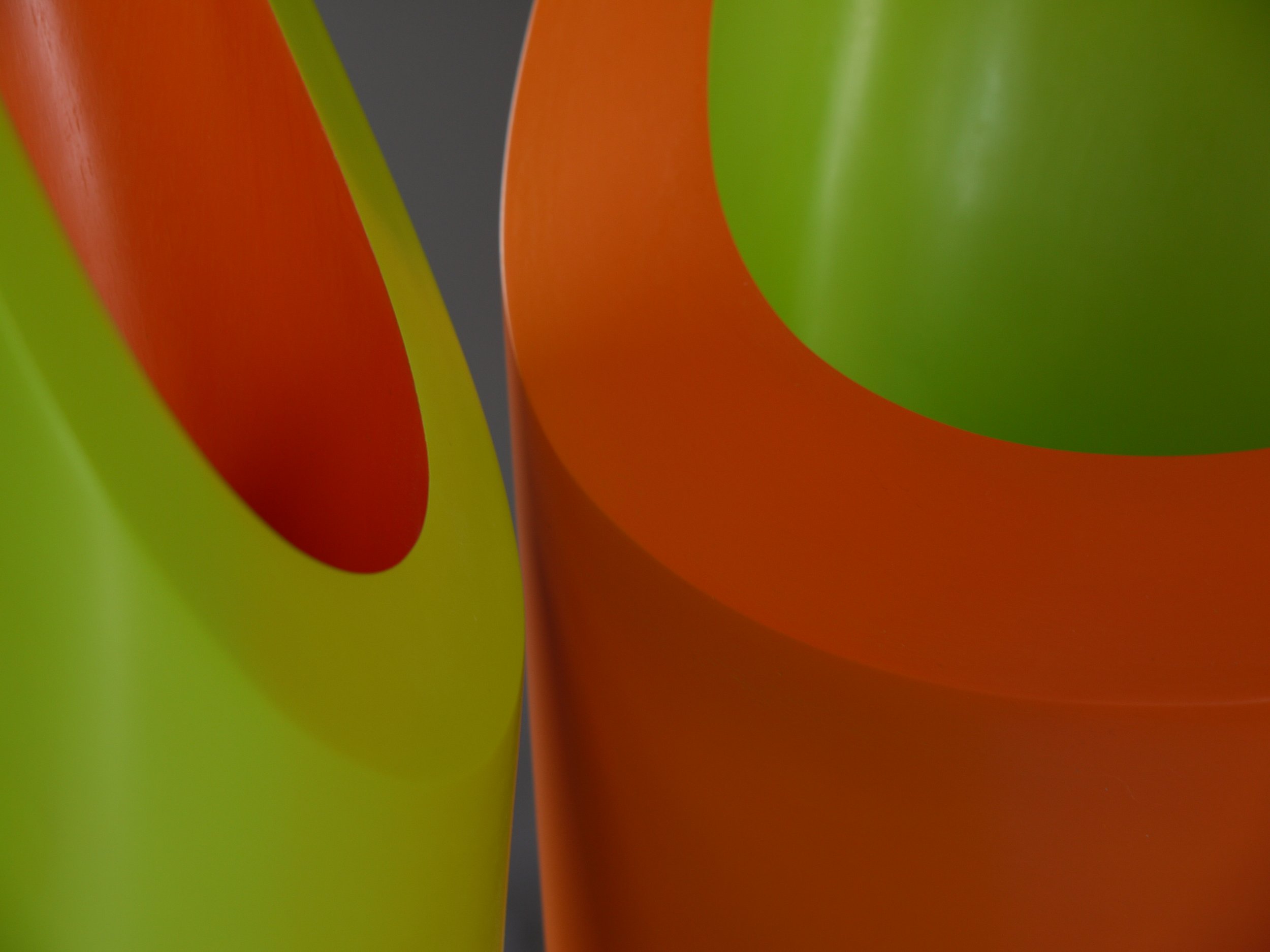
It is often assumed that applied artists are primarily concerned with the making process and practical function of their work, over and above conceptual and intellectual endeavours. However, here all the exhibited work sees these factors on equal footing. Colour is not a mere decorative afterthought, but is fundamental: it is at the core.
All the invited artists are recognised for their intelligent exploration of colour, indeed it has been the subject of PhD studies by both Heike Brachlow and Sara Moorhouse. Heike has developed a new system for creating kiln formed coloured cast glass, including polychromatic tones, that which takes on another colour in alternative light. The practical application of this research, in hypnotically beautiful sculptural series of cast units of gradating tones highlights her control of the medium.
Sara Moorhouse’s research and practice revolves around the relationship between colour, space and form inspired by the landscape. These themes are distilled into controlled bands of colour applied to elegant bowls. The simultaneous optical relationship of the interior and exterior of the striations of colour on the bowl is at the core of Sara’s research, a short précis of which can be found on the following pages.
For Kate Blee, the application of dye onto cloth is more spontaneous and almost alchemical, but there is no element of chance: her understanding of colour relationships is innate. The poetry of her work is in the impact of the ‘whole’: the large scale composition that can move the viewer from afar, but also the elegance of the detail. The bleeding of colour from one to another is mesmerising, demonstrating her total sensitivity for her process.
The experience of colour is an abstract sensation that escapes the boundaries of form. It is emotional and personal like taste and smell and our individual experience and relationship with colour is unique. Colour becomes, in itself, symbolic, and can be experienced to become a potent and powerful communicator, creating links and associations across culture and history. I use colour to express an emotion and the scale, proportion and nature of the colour is intrinsic. When someone says” I don’t like green” or “what’s your favourite colour?” I do not understand. You cannot simplify colour like that. Kate Blee 2011
Nicholas Rena has a similarly alchemic approach to colour, indeed he describes himself as superstitious about not choosing the colour of his ceramic vessels before making. The form of his commanding vessels dictates the colour choice: a palette of two shades becomes apparent, depending on whether the structure is, for example, squat, stretched, elegant or sombre. His relationship with colour (and form) has profound spiritual depth: the revelation of certain colour combinations is celebratory and has been known to make him dance in delight.
By contrast, over Ann Sutton’s long career in textiles, she has been famed for her use of saturated colour, but in an unemotional, highly ordered fashion. A true constructivist, the use of colour was functional: a way to identify the numeric systems and logic she was employing to create structure. As she explains:
In my former life, committed to weaving, structure tended to take top slot in my heart. Colour played an important part but as an assistant to the structure: something to explain what I was up to: an identifier of units. Needing a series of colours, which could have been numbers in the way I was using them, I chose to use spectrum colours at full saturation, and marvelled at the way in which my systematic way of working threw up some crazy juxtapositions. Now that I have transferred my attention to paint, colour is playing a major role, demanding a different attention. When I've worked it out, I'll be back to you. One thing is becoming clear: colour at full saturation is no longer enough to shock senses, and fluorescence is creeping in, making my previously bright colours look funereal. Ann Sutton, 2011
No doubt now that painting rather than weaving has captured her imagination and energies, her relationship to colour has changed with the different medium. The necessary planning and preparation of the warp to dress the loom prior to actually weaving, makes true spontaneity somewhat difficult. Such limitations clearly don’t exist with paint and paintbrush, although interestingly, the grid structure of woven cloth remains.
In my work, colour is something profoundly emotional. I want to create sensations that make the heart sing and the stomach do a back flip. Like Sutton, I sometimes use colour to aid defining a cloth’s structure, but often, is just about visual sensation. After-imaging and other optical effects intrigue me, but are concepts that I find myself exploring subconsciously. I try to take an instinctive approach to colour, and indeed its related partners of pattern, surface and texture: above all I want the result to feel ‘right’, whether it confuses the retina, or soothes the soul.
Due thanks must go to all exhibitors for contributing so willingly to this exhibition. I would also like to extend my gratitude to all at Llantarnam Grange Arts Centre for this exhibition and curatorial opportunity, which has been a real treat to compile. I also wish to thank Toril Brancher for her eloquent and arresting photography, and Icon Design for their considered approach to creating this publication. Thank you too to the Arts Council of Wales for supporting this project.
Laura Thomas, 2011